
Make your move
 Lands between lights and shadows
NEW VERSION 0.1.1 UPDATED ^^
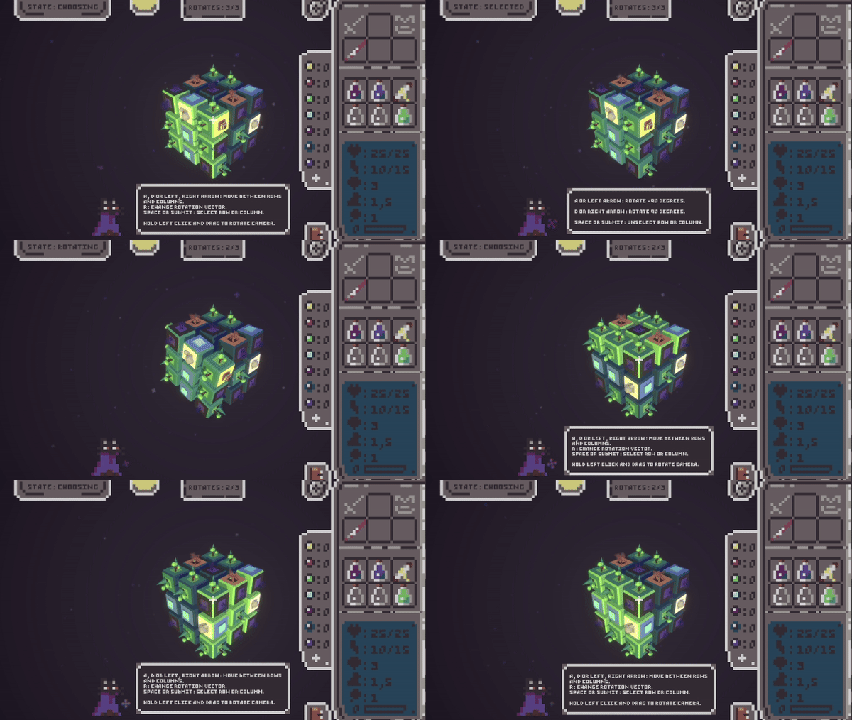
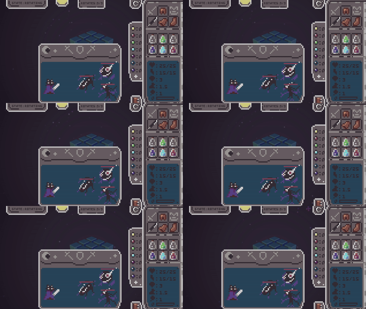
Penumbra is an auto-battle turn based with details of rpg and roguelite where the player controls the map, rotating the cubemaps, as a rubik’s cube to change the pathing. In this prototype version you will have to survive 15 days.

Decide which cubemaps are you gonna play every day. Each one have different rewards or fights to level up!

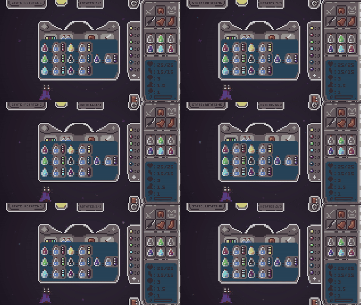
Collect elements that you can use to create Potions with effects.


Imbue your weapon or equipment:


Resources
DOTween asset (License)
Colour Palette https://lospec.com/afterimage
Music
https://opengameart.org/content/soft-mysterious-harp-loop
https://opengameart.org/content/boss-battle-2-8-bit
Weapons hover and hit SFX
https://opengameart.org/content/swish-bamboo-stick-weapon-swhoshes
UI hover and click SFX
https://opengameart.org/content/50-rpg-sound-effects
As a solo dev this prototype project has been a real challenge but very fun too. Recommendation: Play in full screen. In WebGL version VSync is on by default because of nav tab so if you want full fps you need to disable manually in the nav settings.
Thanks in advance for playing it.

| Status | Prototype |
| Platforms | HTML5 |
| Author | AtypicalDev |
| Genre | Action, Adventure, Role Playing |
| Made with | Unity |
| Tags | 3D, Indie, Pixel Art, Roguelite, Singleplayer, Turn-Based Combat, Turn-based Strategy |
Development log
- Prototype Version 0.1.1Aug 21, 2024

Comments
Log in with itch.io to leave a comment.
Wow I absolutely love the pixel art and low poly models, the character looks great and the UI style matches so well.
I gotta be honest though even after reading the tutorial I didn't understand the game at all. And when I started rotating the parts (which was extremely cool btw) I had no idea what I was doing. The battles were also super slow and I was just kinda sitting there waiting for something to do.
I feel like if I could get a better grasp of the game I could go further than I did but with the super slow combat I'm not really eager to jump back into it.
It's a fantastically unique concept and design though and I super vibe with the art.
What an original concept, love the idea of the Rubik's cube! The art direction is great, would've love to see even more. Congrats on completing the jam!
Thanks! I want to keep updating it. Any feedback about gameplay? I'm taking notes
Let me think, there could be some improvements maybe not on the gameplay but more on the UX. Some controls felt a bit difficult to handle and the tutorial is a bit overwhelming. I would've love something more "fluid" maybe ? I dunno.
Nice, yep one of the improves I want to do is on the tutorial and some buttons
Amazing game!! I really like the mechanics and the art (both visual and sound) is really cool!! Only could play a little bit but i'll try to finish it in the future!
Muchas gracias 😊
Lo he conseguido!!!
Como críticas/cosas a arreglar, me parece que una vez le das a new game la pantalla tarda mucho en cargar, la espada que te da +1 luck al empezar no te suma suerte, y a veces (no sé si es bug o una mecánica que no he pillado) una fila no se ilumina y no te deja hacer giro si está afectada esa fila, obligándote a hacer un giro que no te beneficia por no permitirte las otras 2 opciones 😢. A parte, lo que siempre te lleva a perder es la estamina, no sé cómo habría que tocar pero subiría estamina y bajaría vida para que puedas perder de otras formas también.
Pero vamos, que me ha flipado el juego. Son cosillas que he visto de haberle echado varias horas, muy buen trabajo!!!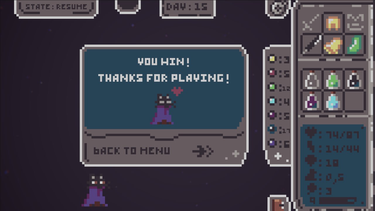
Muchas gracias por tú tiempo y que alegría ver que te ha gustado tanto como para completarlo. Respecto al arma que da +1 de luck puede ser bug de texto (me lo apunto y reviso las descripciones). El giro siempre deberías poder girar como quieras así que si no ha dejado es fallo y a va a la lista de bugs. Y sobre el feedback del gameplay con la estamina, tengo pensadas nuevas implementaciones y otros cambios para mejorar el loop jugable. De nuevo gracias por la review ayuda mucho.
I really enjoyed this. Great game! LOVED the music, sounds like an 8 bit version of a Nightwish song. The text is a bit hard to read, it's too low res pixel for me, maybe a slightly more readable pixel font like Silkscreen would be better, love the rubiks cube idea, very cool concept! Excellent work
Thanks al lot for the feedback. This was my first time making a font, take note about it to improve it